How to create a Modal Component with Vue.js
In this tutorial, we are going to learn about how to create a modal component using the Vue.js.
Getting Started
This tutorial assumes that you already created a new vue project by using Vue-cli
Let’s create a new component called Modal.vue inside the components folder.
Now, add the following code.
<template>
   <div>
      <div v-if="isOpen">
          <h1>Modal heading</h1>
          <p>This my first modal using vue.js</p>
      </div>
      <button @click="isOpen=!isOpen">Open modal</button>
   </div>
</template>


<script>
   export default{
       data:function(){
          return {
      isOpen: false
    };
       }
   }
</script>
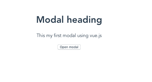
Here we created our modal template with two div tags and one button element. The button is used to open our modal.
In our second div tag, we added a v-if=isOpen directive so that our modal will only open if the isOpen property is true.
Let’s test our modal component by importing it inside the App.vue file, don’t worry we will add styles and transitions too.
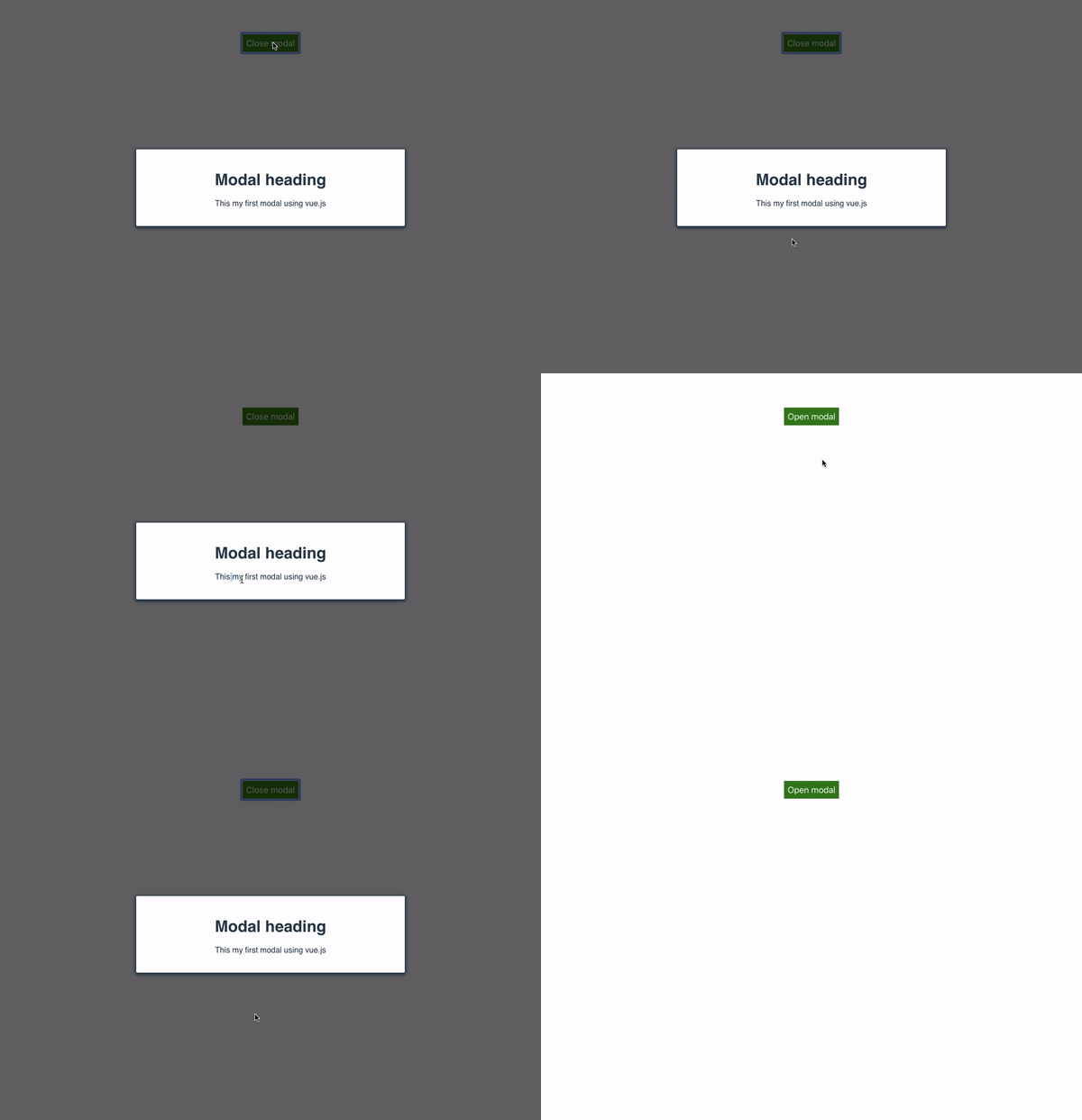
If we toggle on a Open modal button our modal will open.
Adding styles and transitions
Vue offers us a custom transition element which helps us to add and remove the transitions to our HTML elements.
Let’s add the styles and transitions to our Modal component.
<template>
  <div>
    <transition name="modal">      <div v-if="isOpen">
        <div class="overlay" @click.self="isOpen = false;">
          <div class="modal">
            <h1>Modal heading</h1>
            <p>This my first modal using vue.js</p>
          </div>
        </div>
      </div>
    </transition>
    <button @click="isOpen = !isOpen;">
      {{ isOpen ? "Close" : "Open" }} modal
    </button>
  </div>
</template>

<script>
export default {
  data: function() {
    return {
      isOpen: false
    };
  }
};
</script>

<style scoped>
.modal {
  width: 500px;
  margin: 0px auto;
  padding: 20px;
  background-color: #fff;
  border-radius: 2px;
  box-shadow: 0 2px 8px 3px;
  transition: all 0.2s ease-in;
  font-family: Helvetica, Arial, sans-serif;
}
.fadeIn-enter {
  opacity: 0;
}

.fadeIn-leave-active {
  opacity: 0;
  transition: all 0.2s step-end;
}

.fadeIn-enter .modal,
.fadeIn-leave-active.modal {
  transform: scale(1.1);
}
button {
  padding: 7px;
  margin-top: 10px;
  background-color: green;
  color: white;
  font-size: 1.1rem;
}

.overlay {
  position: fixed;
  top: 0;
  left: 0;
  display: flex;
  justify-content: center;
  align-items: center;
  width: 100%;
  height: 100%;
  background: #00000094;
  z-index: 999;
  transition: opacity 0.2s ease;
}
</style>
In the above code, we wrapped our modal with transition element.
transition: In transition element, we need to add a name attribute with transition name.
Let test our modal again.

Have you seen we have also added an overlay to our modal with click listener so that we can close our modal by clicking on the overlay?


