Vue tabs tutorial-Dynamically switch components
In this tutorial, we are going to learn about how to dynamically switch from one component to another component by creating a tabbed interface with Vue.js.
Getting started
Let’s create a new vue project by using vue-cli.
Open your terminal and run the following command to create a vue project.
vue create vue-tabsThis above command will download the vue-related files inside the vue-tabs folder.
Now change your current working directory by running the below command.
cd vue-tabsNow open your vue-tabs project folder in your favorite code editor.
Creating components
Let’s create two new components called Home and Contact inside our components folder.
Home component
<template>
  <div>
   <h1>This is Home component</h1>
  </div>
</template>

<script>
export default {};
</script>
Contact component
<template>
  <div>
   <h1>This is Contact component</h1>
  </div>
</template>

<script>
export default {};
</script>
Creating tabs
Let’s create a tabbed interface by importing our two components inside App.vue file.
Vue.js provides us a <component> element which is used to render the components dynamically by adding :is special attribute.
<template>
  <div>
    <button v-for="tab in tabs" :key="tab" @click="selected = tab;">
      {{ tab }}
    </button>

    <component :is="selected"></component>  </div>
</template>

<script>
import Home from "./components/Home";
import Contact from "./components/Contact";

export default {
  data: function() {
    return {
      tabs: ["Home", "Contact"],      selected: "Home"    };
  },
  components: {
    Home,
    Contact
  }
};
</script>
Inside our template we have added a <component> element with :is="selected"
attribute,by default selected property is pointing to Home component.
We are updating our selected property based on the name of a component.
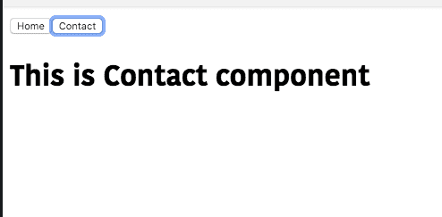
Let’s test our app.
Adding styles
Let’s add the active styles to our tab button so that we can know currently which tab is displaying.
Update your App.vue file by adding below styles.
<template>
  <div>
    <button
      v-for="tab in tabs"      :key="tab"
      @click="selected = tab;"
      :class="['tab-btn', { active: selected === tab }]"    >
      {{ tab }}
    </button>

    <component :is="selected" class="tab"></component>
  </div>
</template>

<script>
import Home from "./components/Home";
import Contact from "./components/Contact";

export default {
  data: function() {
    return {
      tabs: ["Home", "Contact"],
      selected: "Home"
    };
  },
  components: {
    Home,
    Contact
  }
};
</script>

<style>
.tab-btn {
  padding: 6px 10px;
  background: #ffffff;
  cursor: pointer;
  margin-bottom: 1rem;
  border: 2px solid #cccccc;
  outline: none;
}

.active {
  border-bottom: 3px solid green;
  background: #fcfcf;
}

.tab {
  border: 1px solid #ccc;
  padding: 10px;
}
</style>
output:

- Share:


