React Modal tutorial using hooks
In this tutorial, we are going to learn about how to create a modal in react using hooks.
Getting started
First, we are going a set up a new react app by using the below command.
npx create-react-app react-modalNow change your current working directory by using the following commands.
cd react-modal
npm start # to start the development server
Modal state initialization
Now open the react-modal folder in your favorite code editor and navigate to App.js file and replace with below code.
import React, { useState } from "react";import "./styles.css";

function App() {
  const [show, setShow] = useState(false);  const openModal = () => setShow(true);
  const closeModal = () => setShow(false);

  return (
    <div className="App">
      <h1>Creating react modal</h1>
      {!show && <button onClick={openModal}>Show modal</button>}    </div>
  );
}

export default App;
In the above code, we first imported useState hook from react package and initialized with a value
false.
The useState hook returns an array with two properties which are show and setShow.
setShow is a function which is used to update the state.
The closeModal and openModal functions are used to opening and closing the modal.
We also added !show in front of button element so that button only renders when a modal is not open.
Creating Modal component
We have initialized our Modal state and functions in the above section, now we are going to create a modal component.
create a new file called Modal.js in your src folder and add the below code.
import React from "react";

function Modal(props) {
  const { show, closeModal } = props;
  return (
    <>
      <div className={show ? "modal" : "hide"}>        <button onClick={closeModal}>X</button>
        <h1>Modal heading</h1>
        <p>This is modal content</p>
      </div>
    </>
  );
}

export default Modal;
In the above code, the Modal component is accepting two props(show,closeModal) and we have added a ternary condition to div element.
{show ? "modal" : "hide"}It means we are adding a modal class to div element if only show prop is true otherwise we are adding hide class.
Using Modal Component
Let’s use the Modal component now by importing it inside App.js file.
import React from "react";
import Modal from './Modal.js';

function App() {
  const [show, setShow] = useState(false);

  const openModal = () => setShow(true);
  const closeModal = () => setShow(false);

  return (
    <div className="App">
      <h1>Creating react modal</h1>
      {!show && <button onClick={openModal}>Show modal</button>}
      <Modal closeModal={closeModal} show={show} />    </div>
  );
}
Adding CSS classes
Inside your style.css file add the below styles.
.App {
margin: 1rem auto;
max-width: 1000px;
padding: 1rem;
}
.show {
display: block;
}
.hide {
display: none;
}
.overlay {
position: fixed;
top: 0;
left: 0;
width: 100%;
height: 100%;
background: #0000003a;
transition: opacity 0.2s ease;
}
.modal {
width: 500px;
position: relative;
margin: 0px auto;
padding: 20px;
background-color: #fff;
border-radius: 2px;
transform: translateY(100%);
transition: transform 0.2s ease;
box-shadow: 0 2px 8px 3px;
font-family: Helvetica, Arial, sans-serif;
}
.modal button {
position: absolute;
right: -1rem;
top: -1rem;
width: 2rem;
height: 2rem;
padding: 0.5rem;
margin: 0 auto;
border-radius: 50%;
box-shadow: 1px 1px 1px #0000003a;
cursor: pointer;
border: 1px solid rgba(0, 0, 0, 0.562);
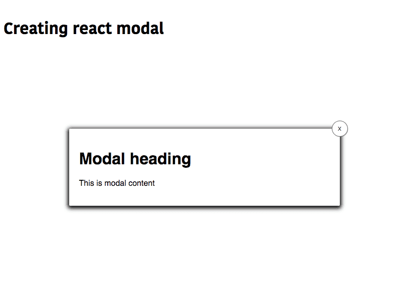
}Let’s test our modal now by navigating to localhost:3000.
If you click on show modal button you will see a modal open with a close button like in the below image.
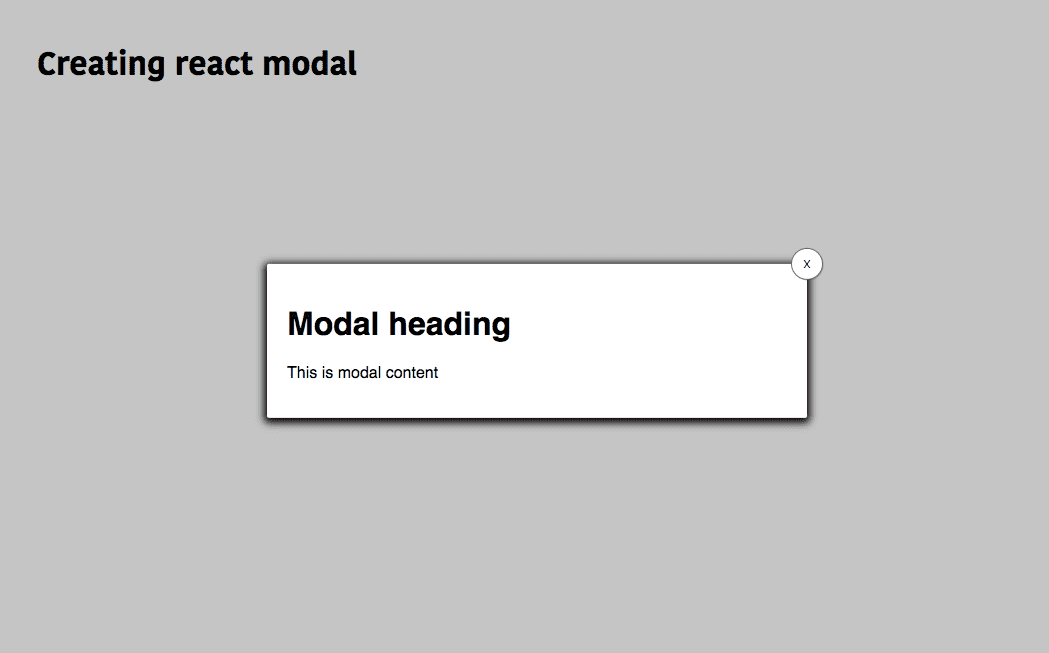
One thing is missing in your modal which is overlay, open your Modal.js file and update with
below code.
import React from "react";

function Modal(props) {
  const { show, closeModal } = props;

  return (
    <>
    <div className={show ? "overlay" : "hide"} onClick={closeModal} />      <div className={show ? "modal" : "hide"}>
        <button onClick={closeModal}>X</button>
        <h1>Modal heading</h1>
        <p>This is modal content</p>
      </div>
    </>
  );
}

export default Modal;
Here we added a div element with overlay class and onClick handler so that we can also close our modal by clicking on overlay.
Let’s test our Modal again.
Bonus
React Portals help us to render a component outside the normal dom flow instead of rendering next to the parent component.
Syntax
ReactDOM.createPortal(child, container)Where is child is a react element and container is a dom element we need to render the child.
By using Portals we can solve the styling issues because parent elements styles are applied to the child elements in css, whenever we are creating modals or tooltips we need to render outside from the parent element so that parent styles are not applied to the child.
Using Portals to render our Modal component
First, we need to add a new html element to our index.html.
Add a below element to your body tag.
<div id="modal-root"></div>Now open your Modal.js file and update with below code.
import React from "react";
import ReactDOM from "react-dom";
function Modal(props) {
  const { show, closeModal } = props;
  const modal =  (<>
      <div className={show ? "overlay" : "hide"} onClick={closeModal} />
      <div className={show ? "modal" : "hide"}>
        <button onClick={closeModal}>X</button>
        <h1>Modal heading</h1>
        <p>This is modal content</p>
      </div>
    </>)
  return ReactDOM.createPortal(     modal, document.getElementById("modal-root")  );}

export default Modal;
Now we are rendering our Modal component inside the modal-root dom node we just added inside index.html file.
- Share:


