A beginners guide to Material UI React tutorial
In this tutorial, we are going to learn about how to use the Material UI framework in React apps.
Material design is developed by Google in 2014, it uses the grid-based layouts, responsive animations and transitions, padding, and depth effects such as lighting and shadows.
Material design is inspired by the physical world objects and its textures how they reflect light and cast shadows.
What is Material UI?
Material UI is one of the famous React UI frameworks with 6 million monthly npm downloads and 43k GitHub stars.
Material UI provides us React components that implement google material design.
Getting started
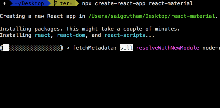
First, we need to set up and install the new react app by using the create-react-app command line tool.
Open your terminal and run following commands.
npx create-react-app react-material
Next, we need to change our working directory by using below commands.
cd react-material
npm start
npm start is used to run the development server.
It’s time to install the Material UI framework by using below commands.
npm install @material-ui/coreNow open your react-material app folder by using your favorite code editor or ide.
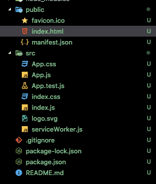
Navigate to your public folder and open index.html and add the below highlightedlink tag.
<!DOCTYPE html>
<html lang="en">

<head>
  <meta charset="utf-8" />
  <link rel="shortcut icon" href="%PUBLIC_URL%/favicon.ico" />
  <meta name="viewport" content="width=device-width, initial-scale=1, shrink-to-fit=no" />
  <meta name="theme-color" content="#000000" />
  <link rel="manifest" href="%PUBLIC_URL%/manifest.json" />
  <link rel="stylesheet" href="https://fonts.googleapis.com/css?family=Roboto:300,400,500" />  <title>React App</title>
</head>

<body>
  <noscript>You need to enable JavaScript to run this app.</noscript>
  <div id="root"></div>

</body>

</html>
Here we updated our HTML file by adding a Google Roboto font because material UI was designed with the Roboto font in mind.
Let’s design our App header using Material UI components
Now in App.js file we are importing <AppBar> component from the ‘@material-ui/core/AppBar’.
import React, { Component } from 'react';
import AppBar from '@material-ui/core/AppBar';
class App extends Component {
render() {
return (
<div>
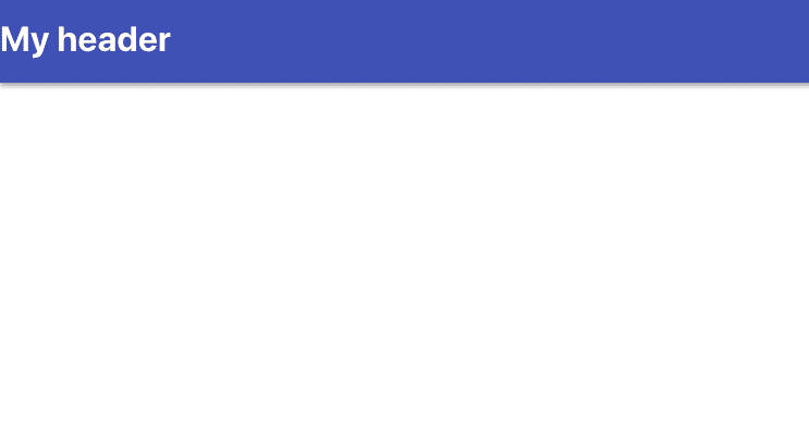
<AppBar color="primary" position="static">
<h1>My header</h1>
</AppBar>
</div>
);
}
}
export default App;In AppBar component we passed two props color and position
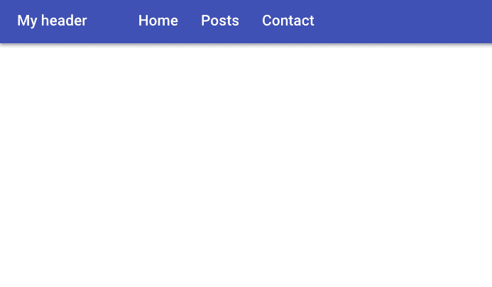
Now you can see a Header with primary color is rendered on the screen.
Let’s replace our h1 element with Material UI TypoGraphy Component.
import React, { Component } from 'react';
import AppBar from '@material-ui/core/AppBar';
import Toolbar from '@material-ui/core/Toolbar'
import TypoGraphy from '@material-ui/core/Typography'


class App extends Component {
  render() {
    return (
      <div>
        <AppBar color="primary" position="static">
          <Toolbar>
            <TypoGraphy variant="title"
              color="inherit"
            >
              My header
           </TypoGraphy>
          </Toolbar>
        </AppBar>

      </div>
    );
  }
}
export default App;
In the above code first we imported two component which are ToolBar and TypoGraphy from ‘@material-ui’ framework.
In TypoGraphy component we passed two props variant and color.
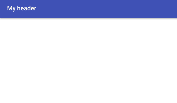
Have you seen how we got more spacing over our heading?
Adding Nav bar
Let’s add the Navbar to our Header.
create a new file called navbar.js in your src folder.
import React from 'react';
import List from '@material-ui/core/List';
import ListItem from '@material-ui/core/ListItem';
import ListItemText from '@material-ui/core/ListItemText';
import TypoGraphy from '@material-ui/core/Typography'


function NavBar(props) {

    return (
        <List component="nav">
            <ListItem component="div">
                <ListItemText inset>
                    <TypoGraphy color="inherit" variant="title">
                        Home
               </TypoGraphy>
                </ListItemText>


                <ListItemText inset>
                    <TypoGraphy color="inherit" variant="title">
                        Posts
               </TypoGraphy>
                </ListItemText>


                <ListItemText inset>
                    <TypoGraphy color="inherit" variant="title">
                        Contact
               </TypoGraphy>
                </ListItemText>
            </ListItem >

        </List>
    )
}


export default NavBar;
Inside the navbar.js we imported ListItem and ListItemText component.
In ListItem component we added component prop value to nav so that we can get html nav element.
Material ui svg icons
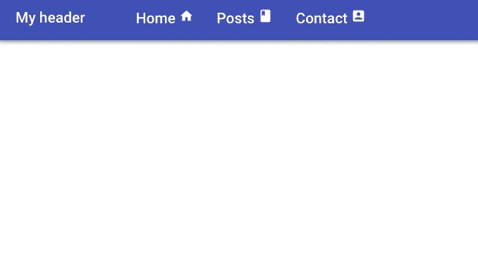
Material UI provides us with SVG material icons to use in our react app.
Let’s install the icons package in our app so that we can use icons as React components.
npm install @material-ui/iconsLet’s Import the icons inside our navbar.js file.
import React from 'react';
import List from '@material-ui/core/List';
import ListItem from '@material-ui/core/ListItem';
import ListItemText from '@material-ui/core/ListItemText';
import TypoGraphy from '@material-ui/core/Typography'
import ListItemIcon from '@material-ui/core/ListItemIcon'
import { Home, Book, AccountBox } from '@material-ui/icons'

function NavBar(props) {

    return (
        <List component="nav">
            <ListItem component="div" >

                <ListItemText inset>
                    <TypoGraphy color="inherit" variant="title">
                        Home  <Home />
                    </TypoGraphy>
                </ListItemText>


                <ListItemText inset>
                    <TypoGraphy color="inherit" variant="title">
                        Posts <Book />
                    </TypoGraphy>
                </ListItemText>

                <ListItemText inset>
                    <TypoGraphy color="inherit" variant="title">
                        Contact <AccountBox />
                    </TypoGraphy>
                </ListItemText>
            </ListItem >

        </List>
    )
}


export default NavBar;
Grid
The Material UI supports responsive grid layouts which adapt to the device screen size and orientation.
Let’s use the Grid component.
Create a two new files called dummy-post.js, posts.js and add the following code.
const posts = [

 {
  title: "My first post",
  excerpt: "This is my first post with more content inside",
  image: "https://bit.ly/2WNi2Ml"
 },

 {
  title: "My second post",
  excerpt: "This is my second post with more content inside",
  image: "https://bit.ly/2WNi2Ml"
 },

 {
  title: "My third post",
  excerpt: "This is my third post with more content inside",
  image: "https://bit.ly/2WNi2Ml"
 },

 {
  title: "My fourth post",
  excerpt: "This is my fourth post with more content inside",
  image: "https://bit.ly/2WNi2Ml"
 },

 {
  title: "My fifth post",
  excerpt: "This is my fifth post with more content inside",
  image: "https://bit.ly/2WNi2Ml"
 },

 {
  title: "My sixth post",
  excerpt: "This is my sixth post with more content inside",
  image: "https://bit.ly/2WNi2Ml"
 }
]import React from "react";
import { Grid, Paper, Typography } from "@material-ui/core";
import Card from "@material-ui/core/Card";
import CardActionArea from "@material-ui/core/CardActionArea";
import CardActions from "@material-ui/core/CardActions";
import CardContent from "@material-ui/core/CardContent";
import CardMedia from "@material-ui/core/CardMedia";
import Button from "@material-ui/core/Button";
import { posts } from "./dummy-posts";
function Posts(props) {
return (
<div style={{ marginTop: 20, padding: 30 }}>
<Grid container spacing={40} justify="center">
{posts.map(post => (
<Grid item key={post.title}>
<Card>
<CardActionArea>
<CardMedia
component="img"
alt="Contemplative Reptile"
height="140"
image={post.image}
title="Contemplative Reptile"
/>
<CardContent>
<Typography gutterBottom variant="h5" component="h2">
{post.title}
</Typography>
<Typography component="p">{post.excerpt}</Typography>
</CardContent>
</CardActionArea>
<CardActions>
<Button size="small" color="primary">
Share
</Button>
<Button size="small" color="primary">
Learn More
</Button>
</CardActions>
</Card>
</Grid>
))}
</Grid>
</div>
);
}
export default Posts;
In the above code, we imported Grid and Card related components.
In Grid Component we passed container prop so that it become grid container.
justifyprop helps us to make our grid items centerspacingprop helps us to create the spacing between individual grid items (supporting values are 8, 16, 24, 32 or 40).
Inside the Grid container component, we passed item prop to the Grid component so that they become grid items.

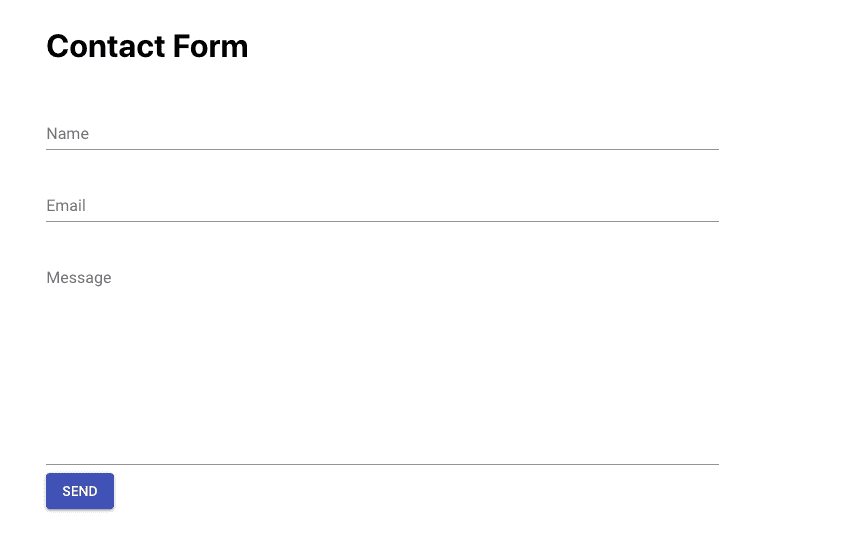
Contact form
Let’s design a contact form using Material UI FormControl and Input components.
create a new file called contact.js in your src folder.
import React from "react";
import {
  FormControl,
  InputLabel,
  Input,
  Button,
  TextField
} from "@material-ui/core";

class Contact extends React.Component {
  render() {
    return (
      <div
        style={{
          display: "flex",
          justifyContent: "center",
          margin: 20,
          padding: 20
        }}
      >
        <form style={{ width: "50%" }}>
          <h1>Contact Form</h1>

          <FormControl margin="normal" fullWidth>
            <InputLabel htmlFor="name">Name</InputLabel>
            <Input id="name" type="text" />
          </FormControl>

          <FormControl margin="normal" fullWidth>
            <InputLabel htmlFor="email">Email</InputLabel>
            <Input id="email" type="email" />
          </FormControl>

          <FormControl margin="normal" fullWidth>
            <InputLabel htmlFor="email">Message</InputLabel>
            <Input id="email" multiline rows={10} />
          </FormControl>

          <Button variant="contained" color="primary" size="medium">
            Send
          </Button>
        </form>
      </div>
    );
  }
}

export default Contact;
Here we first imported the FormControl,InputLabel,Input,Button and TextField components from the material UI framework.
FormControlComponent: In FormControl component we passed margin prop value to normal so that it maintains the distance between input fields, we also passed fullWidth it means to occupy the available space.
InputLabel : The InputLabel component helps us to display the label for our input field.
Input: The Input component helps us display the HTML input field.
if we pass multiline prop to the Input component it will render textarea element instead of input field.
rows prop is used to increase the rows in textarea element.
Output
- Share:


